
Creative People Aren’t Picky-Their Brains Literally See the World Differently
A Creative Perspective:
My friend Sarah, a brand designer, once spent twenty minutes in a coffee shop explaining why she couldn't concentrate. The problem wasn't noise or crowds - it was the menu board behind the counter. Three different fonts, inconsistent spacing, and a logo that had been stretched to fit the space. "It's like trying to read while someone scrapes a fork across a plate," she said. Most customers didn't notice anything wrong. Sarah couldn't see anything else.
This divide reveals something fundamental about how creative people experience the world. They're not choosing to be particular about design details. Their brains won't let them ignore what's wrong.
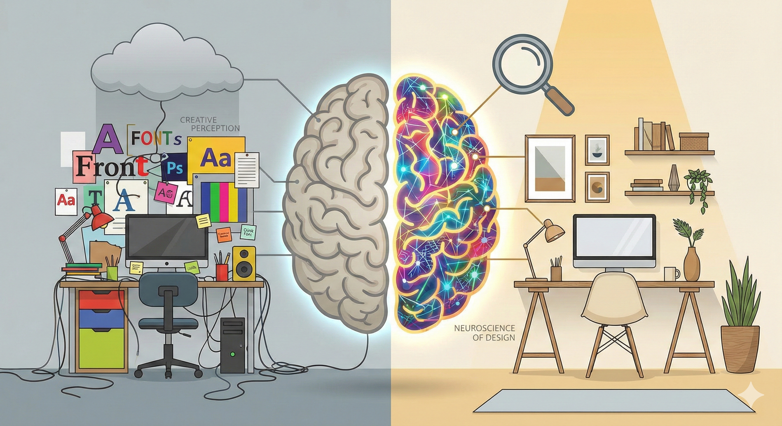
The Neuroscience Behind Design Hypersensitivity
The difference starts with how creative brains process visual information. Dr. Oshin Vartanian's research at the University of Toronto using fMRI scans found that when viewing identical images, designers showed significantly higher activation in the right posterior superior temporal sulcus - a region associated with processing complex visual patterns and social cues from faces. Their brains were literally working harder to extract meaning from what they saw.
When most people look at a website, they see content and pictures. A designer sees something closer to an x-ray: the grid system underneath, the spacing ratios between elements, the font weights creating hierarchy, the color relationships establishing mood.
An art director I interviewed described watching movies as exhausting - part of her brain automatically catalogs production design choices she can't turn off. A product designer said he picks up every object he encounters, testing weight distribution and surface finish. This isn't trained observation you can switch off. It's perceptual reality running constantly in the background.
Why Materials Speak Louder Than Words
Creative people develop what I call "material literacy" - the ability to read what objects communicate through their physical properties. Touch becomes information as critical as sight.
I watched a packaging designer evaluate prototype boxes for a tech product. She barely glanced at them initially. Instead, she picked each one up, flexed the corners, ran her thumb along the seams, tested how the flap closure felt. One box got rejected immediately because "the cardstock has too much give - it telegraphs cheapness before you even open it."
This tactile database comes from experience. When you've worked with hundreds of materials, you develop intuitive recognition. Soft-touch coatings that feel premium versus ones that feel plasticky. Paper stocks that suggest quality versus economy. Metal finishes that improve with age versus ones that show wear poorly.
The phone case market demonstrates this perfectly. Most people choose based on drop protection ratings and price. Creative professionals ask different questions: How does this texture feel after holding the phone for an hour? Will this material show fingerprints constantly? Does the button cutout placement feel precise or sloppy?
When you interact with an object fifty times a day, every small friction point compounds. A case that's slightly too slick means constant readjustment. Buttons requiring too much pressure create finger fatigue. A finish that attracts smudges means perpetual mild irritation.
Creative people who invest in thoughtfully designed, stylish mobile covers aren't making fashion statements - they're eliminating friction from their daily routine. The case becomes invisible when it's right, which is exactly the point.
The Mathematics of Compound Design Failure
Here's what separates creative people from everyone else: they understand that design quality multiplies rather than averages. This mathematical reality isn't intuitive.
A web developer showed me two versions of the same landing page that looked nearly identical to me. He pointed out seven differences: line spacing off by 0.1, margins inconsistent by four pixels, a heading that skipped hierarchy levels, link colors with insufficient contrast, overly sharp button corners, a widow at the end of a paragraph, and improperly centered images.
"Any one of these might be ignorable," he explained. "But together, they don't create a 7/10 page. They create maybe a 3/10. Your conscious brain might not catalog each problem, but your subconscious knows something feels wrong."
I tested this by showing both versions to twenty non-designers. Seventeen preferred the refined version. Only three could articulate why, using vague terms like "feels cleaner." The design details were doing their work invisibly.
This multiplication effect explains why creative people seem obsessive about minor corrections. They're not being perfectionist - they're preventing compound failure. Each small wrong choice makes the next one more noticeable until the whole thing collapses into obvious mediocrity.
Workspace as Cognitive Infrastructure
Walking into a creative person's workspace reveals their relationship with environmental design. There's always intentional lighting - usually multiple sources at different color temperatures because overhead fluorescents create flat, mood-killing illumination.
A creative director I know keeps a machined aluminum cube on his desk that serves no function. When stuck on a problem, he picks it up and feels the precise edges, the perfect weight distribution, the flawless surface finish. It reminds him what "right" feels like.
A UX designer positioned her monitor lower than ergonomic guidelines recommend. The slight downward viewing angle reduces eye strain specifically for her work, which involves constant focus shifts between interface elements. She tested the position in half-inch increments over two weeks.
This isn't obsessive behavior - it's environmental calibration based on deep self-knowledge. They've identified which details genuinely affect work quality and which are noise. When your surroundings feel resolved, your brain doesn't waste processing power on low-level irritation.
When Design Discord Becomes Physical
I was reviewing a website with a graphic designer when she suddenly grimaced. She pointed to a logo stretched horizontally to fit a header space - distorted rather than properly resized. "It makes me physically uncomfortable," she said. "Like watching someone walk with a noticeable limp."
This isn't metaphor. Research by Dr. Anjan Chatterjee at the University of Pennsylvania found that viewing aesthetically displeasing images activates the anterior insula—the same brain region involved in processing physical disgust. Creative professionals with trained visual sensitivity experience this activation more intensely.
Multiple designers have described headaches from poor color contrast, tension from inappropriate asymmetry, even nausea from wrong animation timing. Their nervous systems have been trained through thousands of hours to recognize visual harmony. Discord registers as genuine discomfort.
The emotional stakes run high too. A restaurant with a poorly designed menu raises questions about the kitchen. If they can't execute typography correctly, what about food safety? This connection might seem unfair, but it's based on pattern recognition. Poor design correlates with poor execution because both stem from insufficient attention to detail.
The Permanent Perceptual Shift
Every creative person remembers when their perception permanently changed. A photographer described the moment composition rules clicked - suddenly, every casual photo revealed technical flaws. Off-level horizons, dead-center subjects, flat lighting. He learned to stay quiet because nobody wants that feedback, but he can't unsee the problems.
This is the tradeoff for developing creative skills. You gain the ability to make beautiful things but lose the ability to ignore ugly ones.
A type designer told me that after years working with letterforms, she can't read normally anymore. Part of her brain tracks kerning pairs, examines x-heights, evaluates font selection appropriateness. "It sounds exhausting," I said. "It is," she admitted. "But when I encounter genuinely excellent typography, the appreciation runs so much deeper. Most people think 'that's nice.' I experience it as a small miracle of constraint and intention."
When Detail Obsession Becomes Counterproductive
Here's the tension nobody talks about: sometimes the obsession with micro-details actually damages outcomes.
I've watched designers spend three hours perfecting a button that 90% of users will never click. I've seen creative teams miss deadlines because they couldn't stop refining details that made zero difference to user experience. A product manager once told me, "I love working with designers who care about craft. I hate working with designers who can't prioritize which craft decisions actually matter."
The best creative professionals learn to modulate their detail sensitivity based on context. A logo that will appear on billboards deserves pixel-level scrutiny. A throwaway social media graphic for a one-day promotion doesn't. The skill isn't just seeing what's wrong - it's knowing when fixing it matters.
One creative director described his approach: "I have an internal slider that goes from 'good enough' to 'portfolio piece.' Most work sits at 70-80% on that scale. Save the 100% obsession for projects that genuinely deserve it, or you'll burn out chasing perfection on things that don't require it."
This pragmatic view doesn't diminish the importance of details. It just recognizes that time and energy are finite resources. The wisdom is knowing which details compound into quality and which are simply expensive indulgence.
Building Life Around Intentional Choice
The most accomplished creative professionals I've met share a common trait: their everyday objects are carefully selected. Not necessarily expensive, but deliberate.
A type designer uses a specific mechanical pencil because after testing dozens, this one has the right weight balance for long sketching sessions. An illustrator owns one excellent chef's knife instead of a full block. The same philosophy extends to her workspace: one perfect task lamp instead of three adequate ones, one notebook with ideal paper instead of a drawer full of random ones.
This curation extends to items most people consider mundane. The bag that distributes weight correctly. The water bottle with the right diameter for one-handed use. The phone case that balances protection, texture, and aesthetics without creating new problems.
Creative people evaluate mobile covers through a lens of daily interaction design. Does this material provide adequate grip without feeling sticky? Will it patina gracefully or look worn after a month? These aren't trivial concerns when you interact with an object hundreds of times daily.
What This Means for Everyone Else
If you're not a creative professional, this might all sound exhausting or irrelevant. But there's practical wisdom here worth extracting.
For businesses: If you're hiring creative talent, understand that their "pickiness" about details isn't personality quirk - it's the skill you're paying for. The designer who spots the misaligned icon is the same person who'll catch the user experience flaw before launch.
For non-creatives working with designers: When a designer pushes back on what seems like a minor detail, ask them to explain the compound effect. Often they're seeing three steps ahead to where that small choice creates bigger problems.
For your own life: You don't need designer-level sensitivity to benefit from the core principle. Pay attention to the objects and environments you interact with daily. The chair that causes back pain, the kitchen knife that never feels comfortable, the phone case that's always slipping - these aren't minor annoyances. They're daily friction that accumulates into stress.
You won't develop the hyper-sensitivity of a trained creative, but you can apply the philosophy: invest attention in the things you touch most often. Those details compound into quality of life.
Why Small Details Will Never Stop Mattering
Here's what people misunderstand about creative professionals who care deeply about small details: they're not trying to be difficult. They're managing a perceptual reality that won't turn off.
When Sarah sat in that coffee shop unable to concentrate because of the menu board, she wasn't being precious. Her brain was genuinely distracted by visual discord the same way anyone would be distracted by a dripping faucet. The difference is that most people don't perceive design flaws as environmental noise.
This heightened sensitivity shapes daily decisions in ways non-creatives don't experience. Route choices based on which path has less visual chaos. Restaurant selection influenced by interior design quality. Technology purchases where interface aesthetics matter as much as features.
But it also creates capacity for deeper appreciation. When creative people encounter something truly well-designed - a perfectly balanced composition, an interface where every interaction feels natural, a product where material choice enhances function - they experience it as genuine delight. They see not just the result but the care required to achieve it.
Living with design sensitivity means navigating a world where most things aren't quite right, punctuated by occasional encounters with things that are exactly right. It means surrounding yourself with objects that respect your perceptual acuity rather than fight against it.
It means understanding that small details aren't actually small - they're the infrastructure of experience. And once you see that clearly, you can't go back to not noticing.
Author’s Bio:
I am a creative writer with a passion for tech and lifestyle reviews. I focus on transforming complex ideas and everyday experiences into clear, engaging, and relatable stories. Through honest insights and a creative approach, I aim to inform, inspire, and help readers make confident, well-informed choices.